22 Fall Family Photo Color Schemes That Are Easy to Copy and Look Beautiful
- Rust, Camel, and Cream
- Forest Green and Burgundy
- Denim and White
- Mustard and Chocolate Brown
- Plaid Mixed with Solids
- Blush Pink and Grey
- Olive and Tan
- Navy and Rust
- All Neutral Everything
- Deep Teal and Camel
- Burnt Orange and Chambray
- Dusty Blue and Cream
- Cognac and Black
- Sage Green and Blush
- Copper and Ivory
- Charcoal and Marigold
- Terracotta and Denim
- Warm Grey and Burgundy
- Honey Gold and White
- Rosewood and Grey
- Amber and Denim Layered with Flannel
- Espresso Brown and Soft Peach
22 Fall Family Photo Color Schemes That Are Easy to Copy and Look Beautiful
Fall family photos are one of those things everyone loves until it’s time to actually get everyone dressed and out the door. The color scheme is honestly the make-or-break part. Get it right and the whole shoot feels pulled together without looking like you’re wearing matching uniforms.
I’ve pulled together 22 color palettes that photograph beautifully against classic fall backdrops — think pumpkin patches, tree-lined streets, golden fields, and cozy front porches. Each one is easy to shop for, works across different ages and body types, and avoids that overly staged look. Let’s get into it.
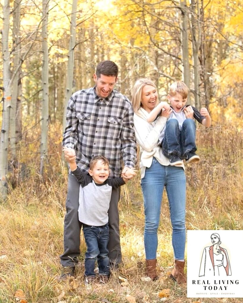
Rust, Camel, and Cream
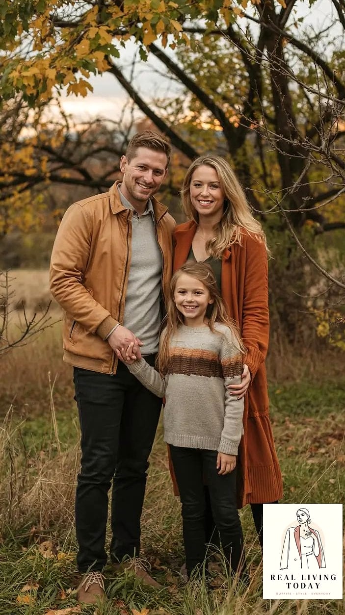
This combo is basically fall in a nutshell. Rust brings warmth, camel keeps things soft, and cream lightens the whole palette so nobody disappears into a sea of dark orange.
Dad can wear a camel sweater, mom a rust-colored midi skirt or wrap dress, and the kids in cream sweaters with little rust accents. It photographs beautifully against orange leaves without being matchy-matchy. Old Navy and Target both do great budget-friendly versions of this palette every September.
Forest Green and Burgundy
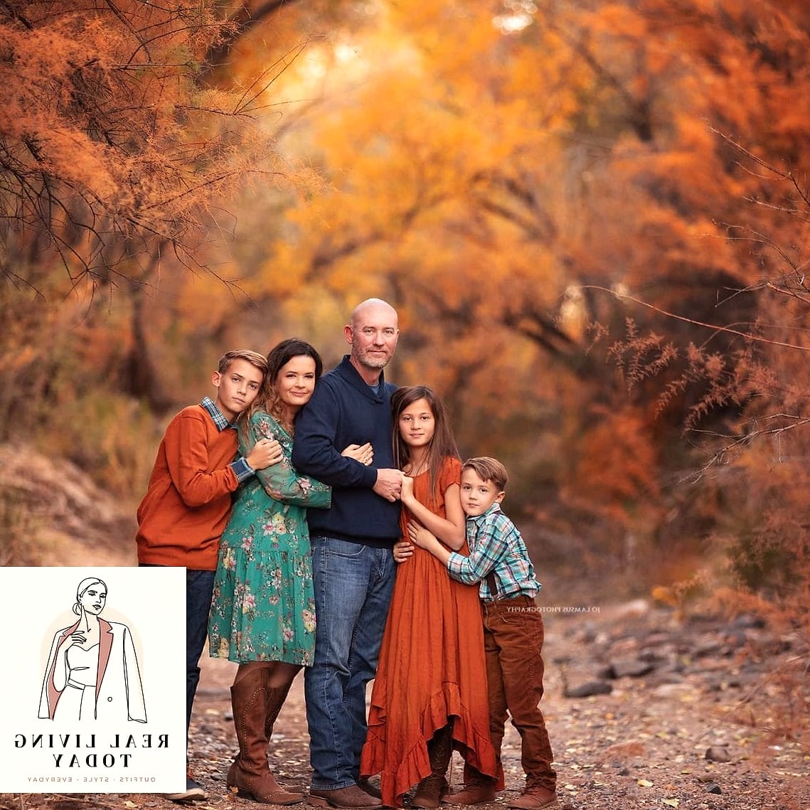
Deep, moody, and incredibly rich against golden fall foliage. This one leans a little more elevated, which makes it great for family photos you actually plan on printing and framing.
Try a forest green flannel or sweater on the guys, a burgundy dress on mom, and let the kids mix both colors in smaller pieces like a beanie or scarf. Anthropocene, sorry — Anthropologie, has gorgeous burgundy knits this time of year that photograph like a dream.
Denim and White
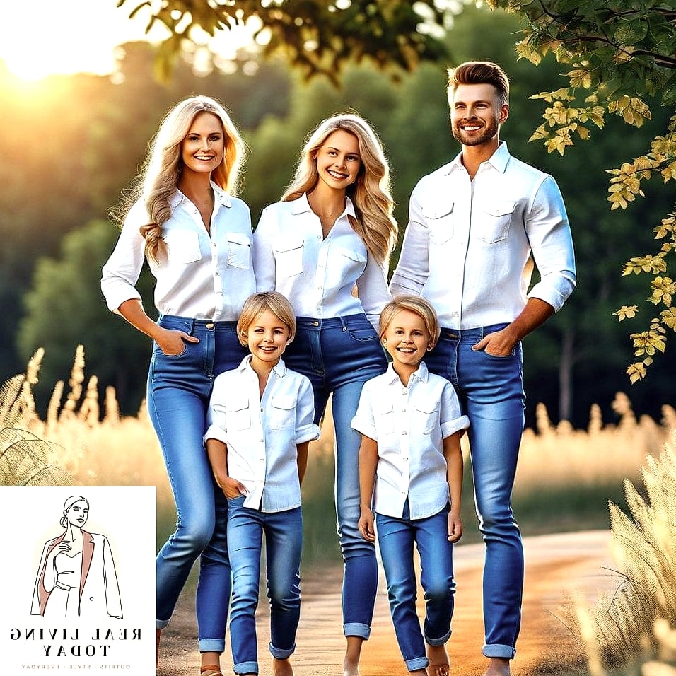
Classic for a reason. Everyone owns denim already, which makes this one of the easiest palettes to pull off without a big shopping trip.
Mix washes for texture instead of matching exactly — light wash on one person, dark wash on another. White sweaters or button-downs keep it crisp. This works especially well for larger families since it never feels overwhelming.
Mustard and Chocolate Brown
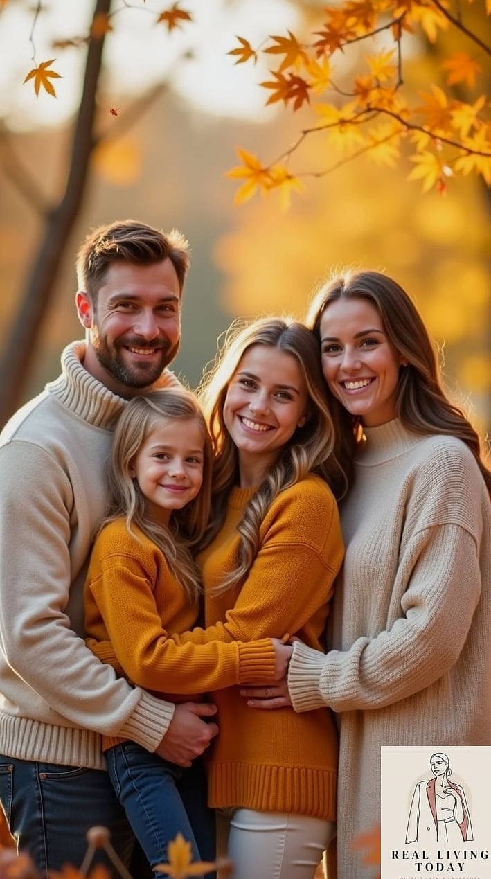
Mustard is having a real moment, and paired with chocolate brown it feels warm without veering into orange-overload territory. Great for golden hour shoots.
A mustard cardigan on mom, chocolate brown trousers or a skirt, and the kids in cream or tan to break things up. This palette genuinely glows in late afternoon light.
Plaid Mixed with Solids
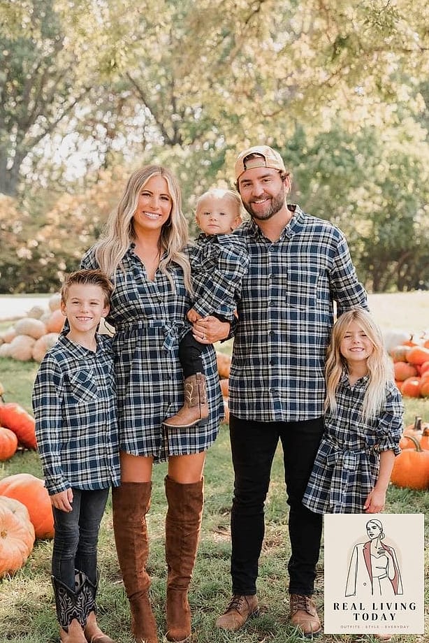
Not everyone needs to wear plaid, and honestly, they shouldn’t. Pick one or two family members to wear a plaid flannel or scarf, then keep everyone else in coordinating solids pulled from the plaid’s color story.
This avoids the dated “everyone in matching plaid” look while still feeling cozy and seasonal. Buffalo check works especially well here.
Blush Pink and Grey
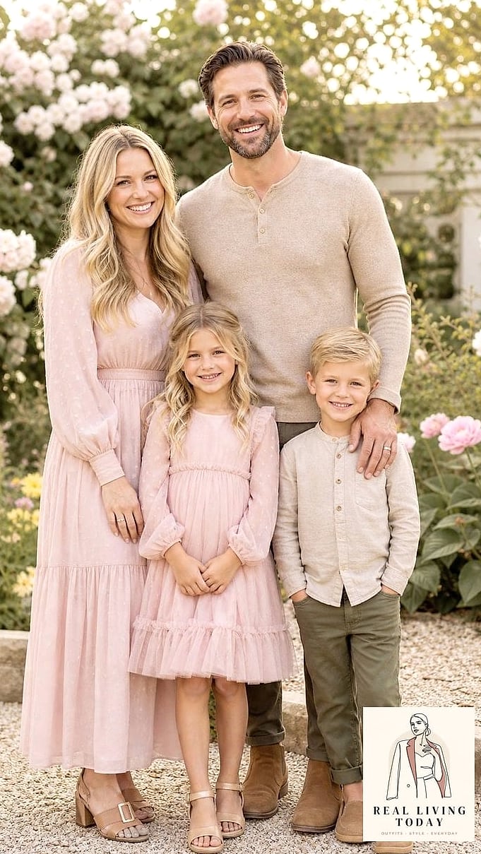
A softer, more modern take on fall that works beautifully if your family isn’t into the traditional orange-and-brown thing. Blush pairs surprisingly well with cooler fall tones like grey and slate.
Mom in a blush sweater dress, dad in charcoal grey, kids in a mix of both. This palette photographs especially well against neutral backdrops like a stone wall or barn.
Olive and Tan
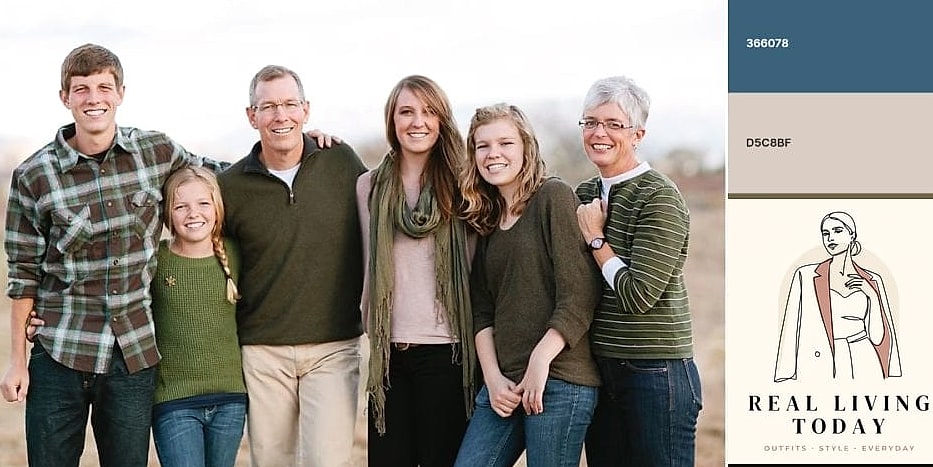
Olive green has quietly become a fall neutral, and it pairs beautifully with tan for an outdoorsy, put-together look. Great if your family spends a lot of time hiking or you’re shooting somewhere rustic.
An olive utility jacket, tan sweaters underneath, and comfortable layers all around. This one also happens to be very gender-neutral, so it works well across mixed-age families.
Navy and Rust
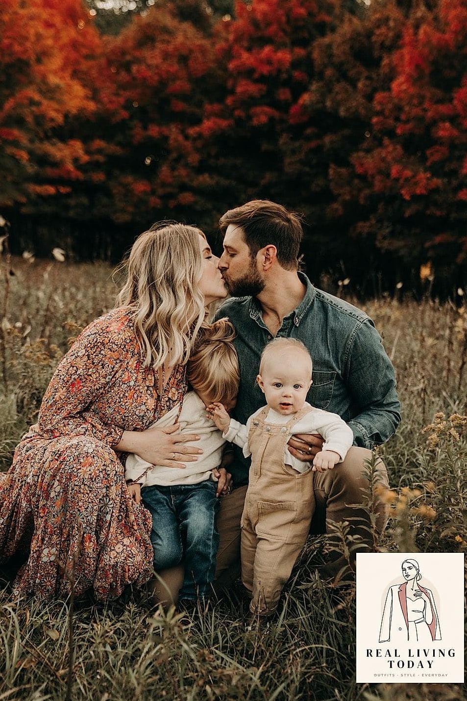
Unexpected but stunning. Navy grounds the palette while rust keeps it feeling like fall instead of winter. This combo photographs particularly well against blue skies.
Try a navy sweater on dad, a rust dress on mom, and let kids wear either color depending on what they already own. Zara has had great navy knits the past few seasons that work perfectly here.
All Neutral Everything
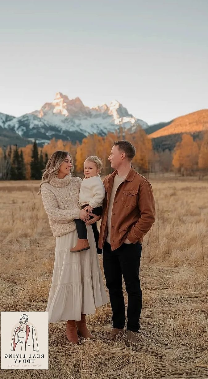
Cream, oatmeal, taupe, and soft grey all mixed together. This palette is having a huge moment on Pinterest right now, and it’s easy to see why — it photographs like an editorial spread with almost no effort.
The key is varying textures, not just colors. Mix a chunky knit with a smooth sweater, add corduroy pants, throw in a waffle-knit top. Texture does the heavy lifting when your colors are this quiet.
Deep Teal and Camel
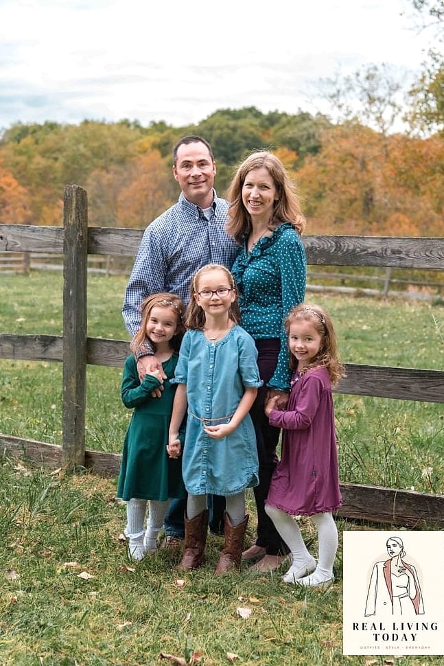
Teal is unexpected for fall, which is exactly why it stands out in photos. Paired with camel, it feels sophisticated without trying too hard.
A teal sweater on mom, camel coat on dad, kids splitting the difference. This one works especially well for evening or golden hour shoots since teal doesn’t wash out the way brighter colors can.
Burnt Orange and Chambray
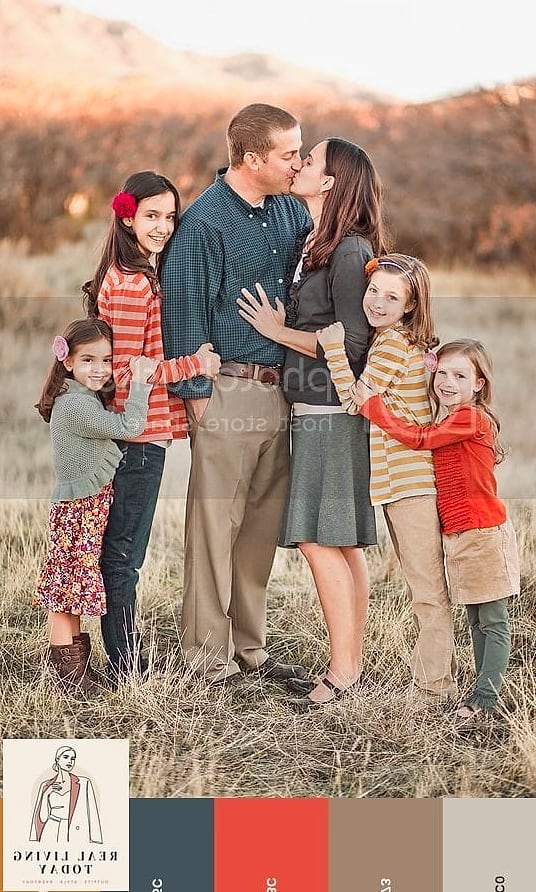
A slightly more playful take on the classic orange-and-blue fall combo. Chambray softens burnt orange so it doesn’t feel too Halloween-adjacent.
Great for a casual, candid-style shoot rather than a formal posed one. Chambray button-downs are affordable and easy to find at H&M or Old Navy.
Dusty Blue and Cream
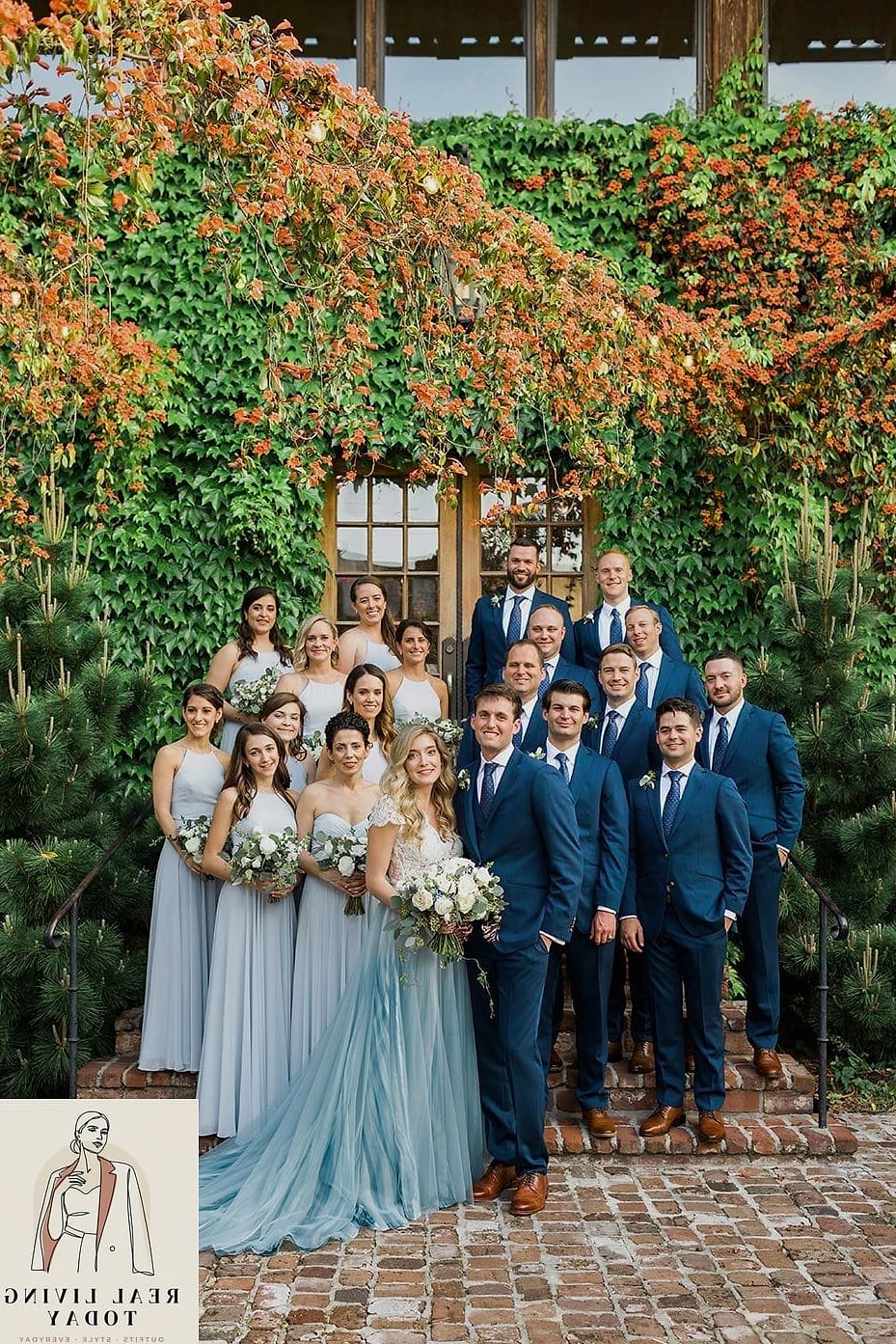
Soft, calming, and a little unexpected for fall since most people default to warm tones. Dusty blue photographs beautifully in overcast light, which is honestly more common than sunny fall afternoons.
Pair with cream sweaters and tan accessories to keep it from feeling too cool-toned or wintery.
Cognac and Black
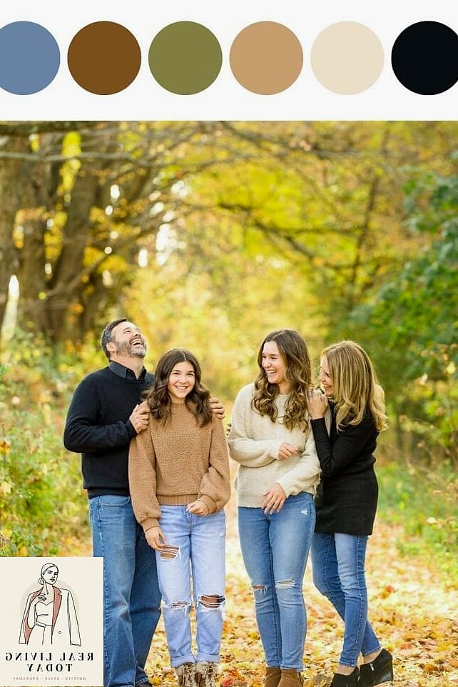
A slightly edgier palette for families who want something with more contrast. Cognac leather adds richness while black keeps things grounded.
A cognac jacket or bag as an accent piece goes a long way here — you don’t need cognac head to toe. This combo photographs especially well in urban or downtown settings rather than rustic ones.
Sage Green and Blush
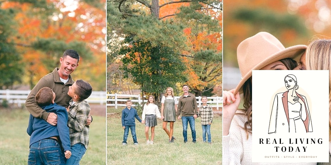
A gentler, almost muted palette that feels very of-the-moment. Sage and blush pair beautifully and neither color competes with fall foliage, so your family stays the visual focus instead of blending into the background.
This works especially well for families with a newborn or young baby, since these tones are soft and forgiving in photos.
Copper and Ivory
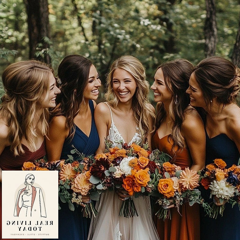
Copper tones add a little shimmer and warmth without going full metallic. Paired with ivory, it feels elevated and slightly dressy, which is great if you’re doing photos for a holiday card.
A copper-toned sweater or accessory catches light beautifully during golden hour.
Charcoal and Marigold
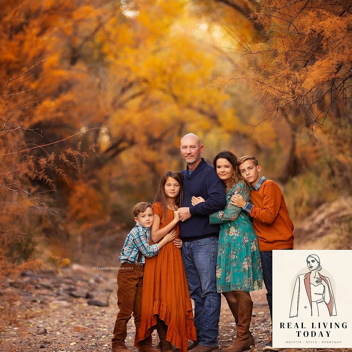
High contrast and genuinely striking. Charcoal keeps things grounded while marigold adds a pop that reads as confidently fall without looking costume-y.
Use marigold sparingly — a sweater on one child, an accessory on another — so it doesn’t overwhelm the palette.
Terracotta and Denim
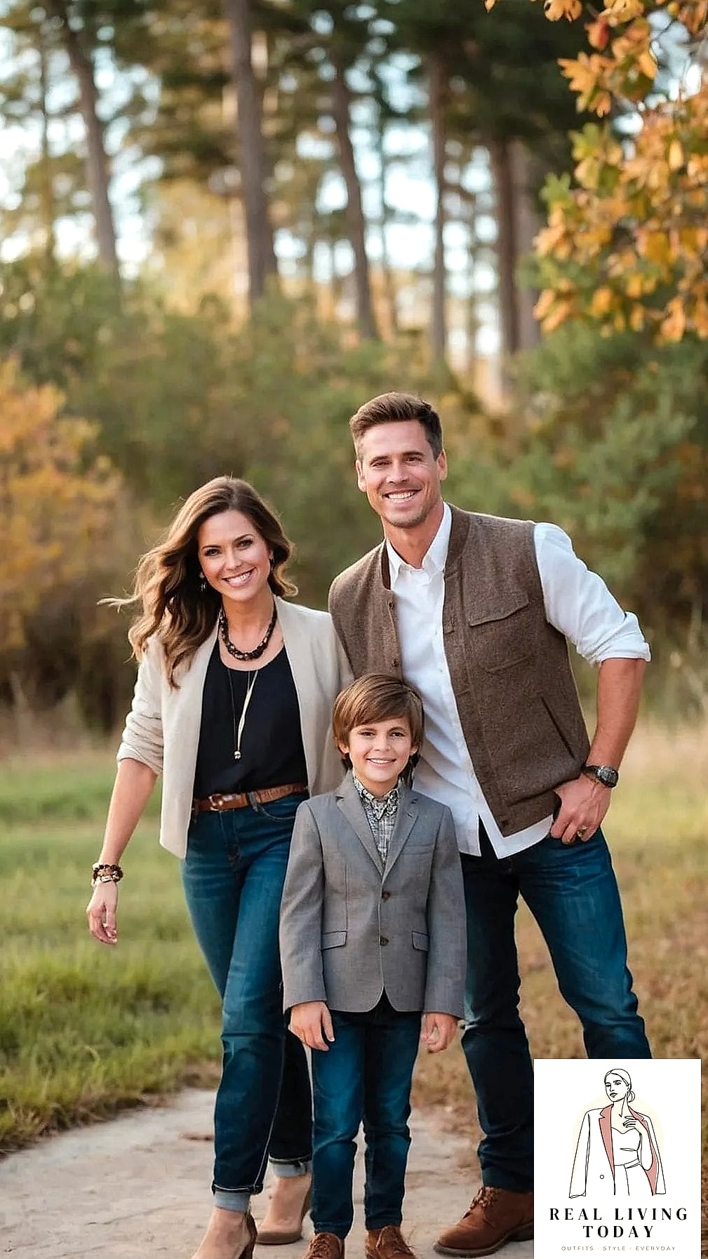
Terracotta has become one of the defining fall colors the past couple years, and pairing it with denim keeps things casual and approachable rather than overly styled.
Great for families who want photos that still feel like “us on a regular day” rather than a formal portrait session.
Warm Grey and Burgundy
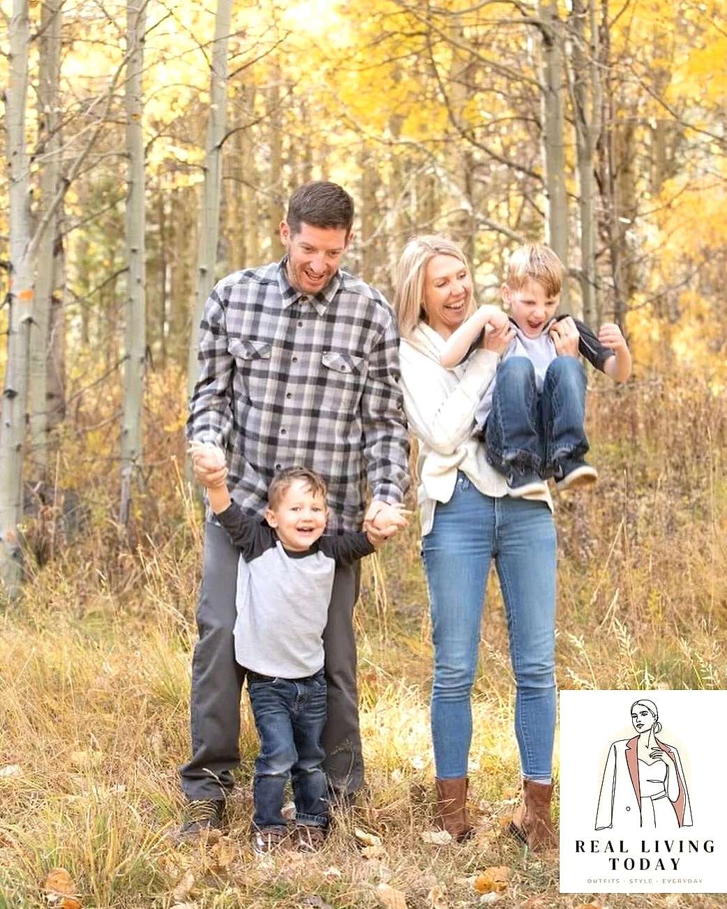
A slightly more subdued alternative to forest green and burgundy. Warm grey keeps the palette from feeling too heavy while burgundy still delivers that classic fall richness.
This combo photographs beautifully against neutral backgrounds like brick or wood fencing.
Honey Gold and White
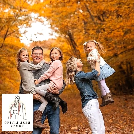
Honey gold is warmer and softer than mustard, making it a little more universally flattering. Paired with crisp white, it feels bright and cheerful rather than moody.
Great choice for families shooting in bright midday sun, since the lighter palette won’t compete with harsh light the way darker tones sometimes do.
Rosewood and Grey
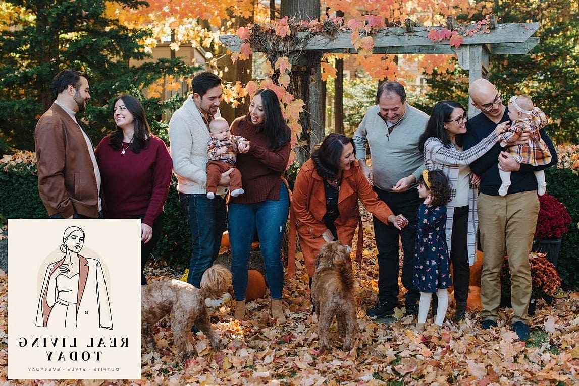
Rosewood is basically burgundy’s softer cousin, and it pairs beautifully with grey for a palette that feels romantic without being overly pink. This one photographs especially well for families who want their photos to feel timeless rather than trendy.
A rosewood sweater dress, grey trousers, and neutral shoes round this one out nicely.
Amber and Denim Layered with Flannel
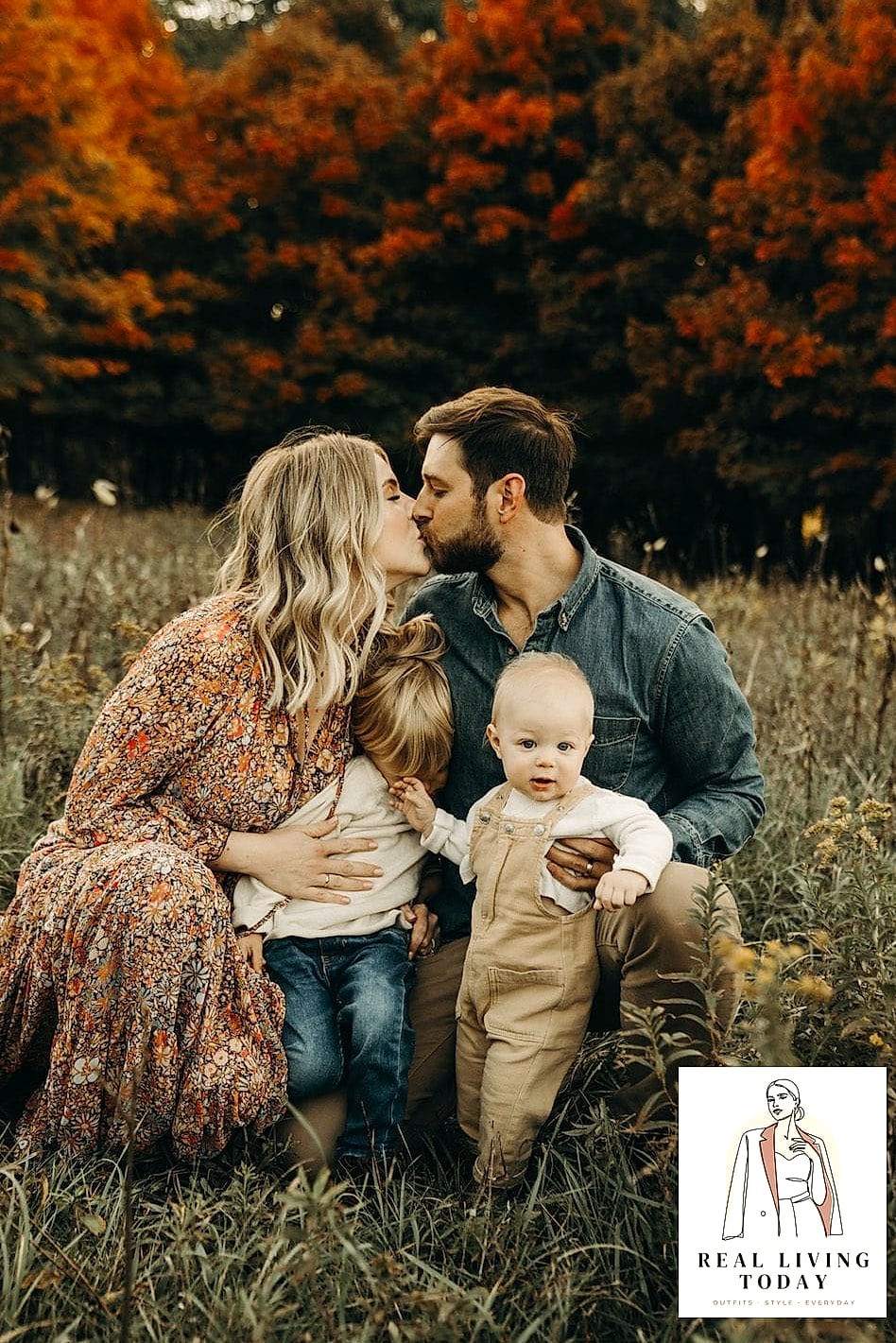
A cozier, more textured take on the classic denim palette. Amber tones add warmth while flannel layered underneath a denim jacket brings in that lived-in, comfortable feeling families often want from fall photos.
This palette works especially well for outdoor, adventure-style shoots — think apple orchards or pumpkin patches rather than studio settings.
Espresso Brown and Soft Peach
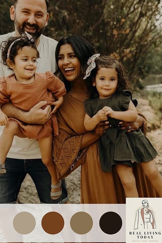
An unexpected but genuinely gorgeous combination. Espresso brown grounds the palette while soft peach keeps it from feeling too heavy or wintery.
This pairing works particularly well for families photographing in late October when the light gets a little softer and cooler, since peach warms things back up.
Final thought — you really don’t need to overthink this. Pick a palette that feels like your family, lean into textures and layers instead of exact color matching, and let the season do a lot of the visual work for you. Any of these 22 fall family photo color schemes will photograph beautifully, and the best one is simply the one everyone will actually feel comfortable wearing.